waveloop: what fable left me
Over the two days we had Fable 5, it made me a music visualizer. This is the realization of something I have daydreamed about for as long as I can remember.
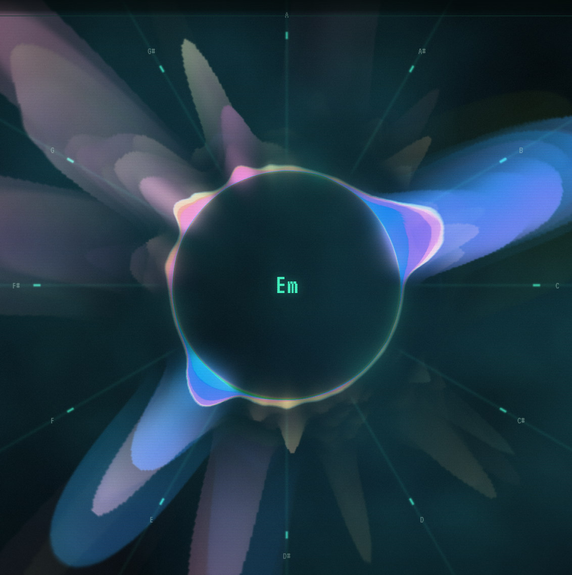
You can see it here: Waveloop
The idea is that a music visualizer should viscerally reveal the harmonic and melodic structure of the music. Most visualizers fail to do this — you get a vague sense of loudness, and maybe the bass/treble split, but that's it.
How can we do better? As we all know, the foundation of Western diatonic music theory is ¹²√2, the ratio between the frequencies of successive semitones. (I ignore other temperaments; they are all close enough to 12-TET.) Twelve of these takes you to the next octave, and notes that are a whole number of octaves apart are considered to be in the same pitch class.
Waveloop captures this cyclic structure in a chromatic circle, 30° per semitone, one revolution per octave. Any instant in the music is captured as a spiral stacked histogram, showing you how much of each pitch class is present. The layers of the histogram are different colors capturing different octaves: muted blues and greens for the bass, fiery orange and red and violet for mid-tones, and sparkly gold and sky for treble, tracing a spiral through oklch.
This representation has some nice properties:
You can read intervals simply as angles. Here are the intervals:
You can tell the quality of a chord from its shape. Transposing rotates the shape; inversion leaves it unchanged. Here are some common chord qualities:
Waveloop primarily operates on an offline basis, where it precomputes a CQT for a particular track, but Fable also gave me a live mic mode. When I turn it on, I find that it's able to identify ukulele chords I play pretty quickly and reliably.
We've been without Fable for about week now, and to remind myself of what once was, I took a look at some of the waveloop code.
The thing that struck me first is that it is dense. While previous models wrote code like a perfectly reasonable upwardly mobile engineer at a FAANG who is on their way to receiving a steady stream of promotions until they cap out at L5, this model writes more like how I'd imagine Terry Davis would have written code alone in his room.
Take a look at this comment at the top of the waveloop file. It wastes no words describing in obvious terms the code it just wrote. The comments seem more like maximally information dense recordings of intent, lockfiles from which something resembling the rest of the code could in principle be derived.
/* The visualizer is a pitch-class wheel: angle = fract(log2(f / 440)), so
   every octave of a note lands on the same spoke (A at 12 o'clock, ascending
   clockwise). The CPU keeps ~5 seconds of per-register-band emission history
   and rasterizes it every frame into the RGBA radial trail map sampled here
   (REGS vertically stacked blocks, T axis = radius; rgb = premultiplied
   register color with fade baked in, a = faded energy): each history row
   sits at the radius its own stored amplitude has carried it to, so motion
   is amplitude-driven - the loudest components shoot across the whole window
   while quiet accompaniment and noise linger near the ring, and the main
   line visually outruns everything else (see rasterTrails below).

   Color is continuous Oklch, computed CPU-side per FFT bin (hue encodes
   absolute frequency on a log scale, red at 20 Hz to violet at 20 kHz;
   lightness climbs the register axis - dark bass, fully saturated mids around
   common fundamentals, pale sparkly treble).

   Display energies live in 0..EMAX (loud fundamentals overshoot 1 instead
   of clipping at the old AGC ceiling); the trail map stores sqrt(v / EMAX)
   in alpha (and rgb premultiplied by that encoded alpha) so the u8 texture
   keeps low-end precision while carrying the extra headroom.

   Because the bands stay separate all the way to the screen, a pitch class
   sounding in several octaves renders as a stacked histogram on the rim
   (low register innermost), with color gliding continuously through the
   register ramp up the stack (u_rim carries the inverse CDF of each angle's
   register distribution) instead of cutting between a few band colors;
   register lives in the stack position and hue, never in the speed.

   The field extends past the farthest screen corner, and radius is a concave
   function of age, so material surges off the rim and decelerates as it drifts
   outward. */
The writing is deeply technical. This model doesn't shy away from drawing upon all its knowledge. It casually refers to alpha premultiplication and fundamental frequencies in the same breath. It is fond of acronyms. CDF, FFT, AGC. I can barely keep up.
The writing is also literary. It draws an analogy between the 12 musical pitch classes and the 12 markings on a clock. Noise lingers. Material surges off the rim. Fable doesn't shy away from using its entire vocabulary to tightly and vividly capture whatever it is it is trying to say.
Here is its function for chord detection. It seems thoroughly solid, and it's kind of surprising how little code it is.
const NOTE_NAMES = ['A', 'A#', 'B', 'C', 'C#', 'D', 'D#', 'E', 'F', 'F#', 'G', 'G#'];

const QUALITIES = [
  { name: '',     ivs: [0, 4, 7] },
  { name: 'm',    ivs: [0, 3, 7] },
  { name: 'dim',  ivs: [0, 3, 6] },
  { name: 'aug',  ivs: [0, 4, 8] },
  { name: 'sus4', ivs: [0, 5, 7] },
  { name: 'sus2', ivs: [0, 2, 7] },
  { name: '7',    ivs: [0, 4, 7, 10] },
  { name: 'maj7', ivs: [0, 4, 7, 11] },
  { name: 'm7',   ivs: [0, 3, 7, 10] },
];

function detectChord() {
  let total = 0;
  for (let i = 0; i < 12; i++) total += chroma[i];
  chromaAgc = Math.max(chromaAgc * 0.995, total, 1e-6);
  if (total < 0.15 * chromaAgc || chromaAgc < 1e-3) return null;

  const c = new Array(12);
  for (let i = 0; i < 12; i++) c[i] = chroma[i] / total;

  let best = null, bestScore = 0;
  for (let root = 0; root < 12; root++) {
    for (const q of QUALITIES) {
      let inS = 0;
      for (let k = 0; k < q.ivs.length; k++) {
        inS += c[(root + q.ivs[k]) % 12] * (k === 0 ? 1.15 : 1);
      }
      const score = inS / Math.pow(q.ivs.length, 0.55);
      if (score > bestScore) { bestScore = score; best = { root, q }; }
    }
  }
  if (!best) return null;
  let frac = 0;
  for (const iv of best.q.ivs) frac += c[(best.root + iv) % 12];
  if (frac < 0.5) return null;   // too much energy outside the chord tones
  return {
    name: NOTE_NAMES[best.root] + best.q.name,
    root: best.root,
    pcs: best.q.ivs.map((iv) => (best.root + iv) % 12),
  };
}
I also had Fable make an explainer video.
This was three prompts. My first prompt was this:
ok fuck it let's ball.

let's also make a manim-based video explaining the mathematical principles
behind waveloop, building up from basic "music theory from first principles"
all the way to fft, cqt, all that dsp, the circular stacked histogram, oklch...
i think we should have a tts plugin that lets you voice it over.
And it was, of course, hot garbage. But after providing this feedback:
ok let's iterate on that video.
- one: the voiceover is atrocious. toebeans has a tts server making use of
  qwen3-tts-voicedesign -- please use a similar sorta thing to narrate the
  video in the configured voice.
- there's a lot of very loud noise that punctuates the narration. not sure why.
- let's make far more use of generated sounds that correspond with the visuals
  on screen.
- let's spend far less time on the very basics and dig a bit more into detail
  about the particulars of the more sophisticated math.
- make the script more conversational. make it feel like you're talking to a
  friend, or watching a 3blue1brown or 2swap video.
- the key, and admittedly difficult: don't belabor any individual point to try
  to cram facts into the watcher's head, but make it feel like the user could
  have discovered this all themselves.
- use far less text in the video. make very interesting and illustrative
  visuals to make up for the lack of text. this isn't a slideshow. text should
  only ever be used as part of a diagram; not to reexplain things that the
  narration already explains.
We had, substantially, the video you see above.
I followed up with one more cleanup request:
that is a LOT better. let’s use proper typesetting for the math, keep a
consistent speaker voice by generating one VoiceDesign sample to condition off
of (or however you do this with qwen tts), and make sure our diagrams aren’t
overlapping.
And that's all it took.
And yeah, it's still not a fantastic video. But it was engaging enough to capture my attention for all ten minutes the first time I saw it.
AI usage disclaimer: I used Claude to generate svgs for the diagrams. But all prose is mine.